
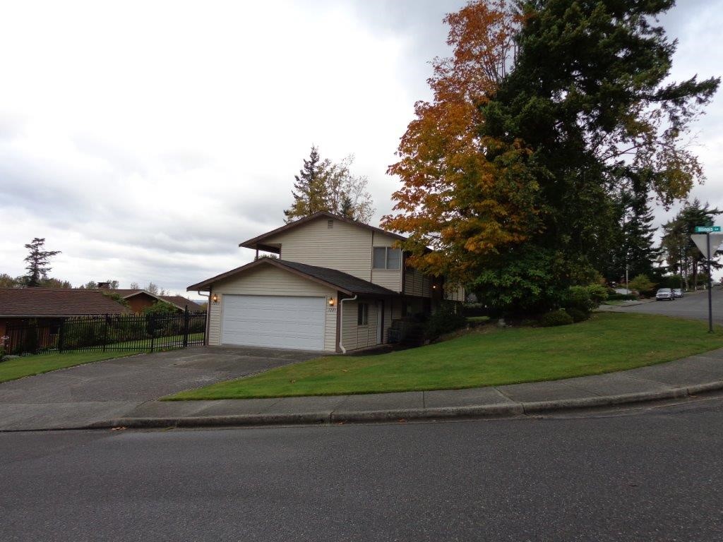
Alabama Hill Reclaimed
With just three days to find a home before our move from Colorado to Bellingham, I took a leap and chose a single-owner house that needed a lot of love—but had seasonal views, the right school district, and amazing trail access.
My husband didn’t see the home until we moved into the lower level with multiple pets and boxes stacked to the ceilings. The entire upstairs had already been gutted, so to say he had faith in both my decision and the long-term vision would be an understatement.
Over the next seven years, we slowly transformed every surface of the home, inside and out, and dedicated just as much care to the landscaping to boost curb appeal. One of our favorite moments was welcoming the original owner back to see the transformation and to share stories from the neighborhood’s earliest days.
We were incredibly grateful to sell at the height of the market and settle into our current home in the Puget neighborhood. (See Puget View Reno.)
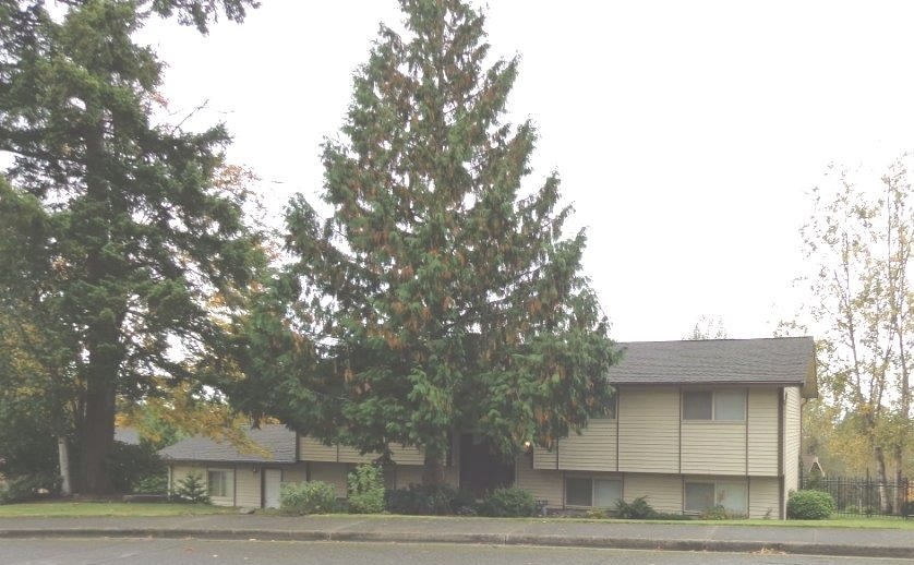
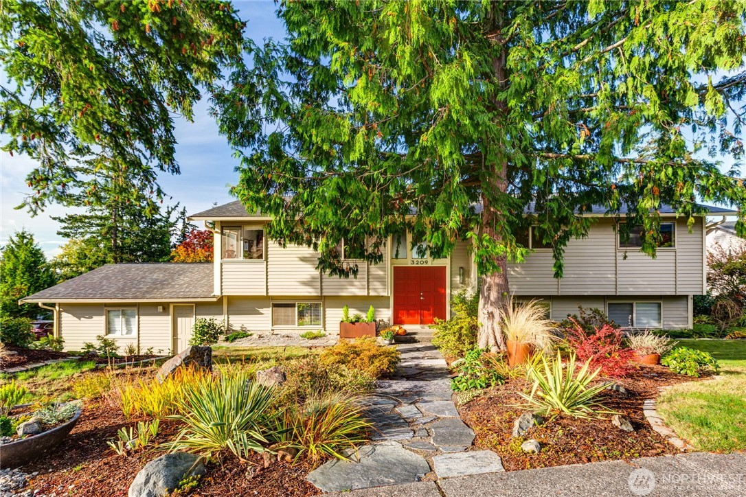
I looked for every possible way to transform the tired brown exterior of this 1972 home into something more interesting and inviting. With much of the budget earmarked for interior renovations, large exterior changes weren’t possible, which made color and material choices especially important. The existing almond-toned window casings guided the color palette, and a creamy green/gray taupe proved to be the perfect complement. The vibrant red front door added a bold focal point and personality. Broken concrete walkways were replaced with flagstone and framed by simple and easy to manage landscaping. A new roof and the addition of solar panels completed the transformation.
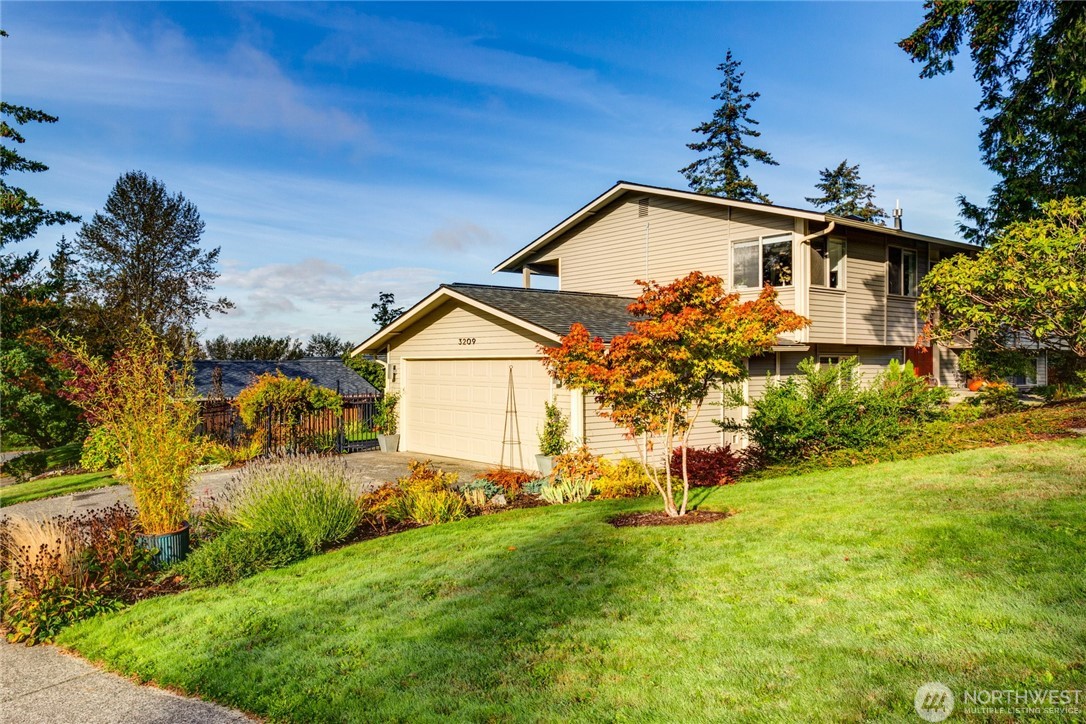
As long-time gardeners, we understood the power of good landscaping. With a yard that felt mostly flat and uninspiring—especially from the driveway—we added sweeping flowerbeds to soften the edges and give color year around. We also planted a specimen maple to introduce seasonal color and give height and dimension to the yard.
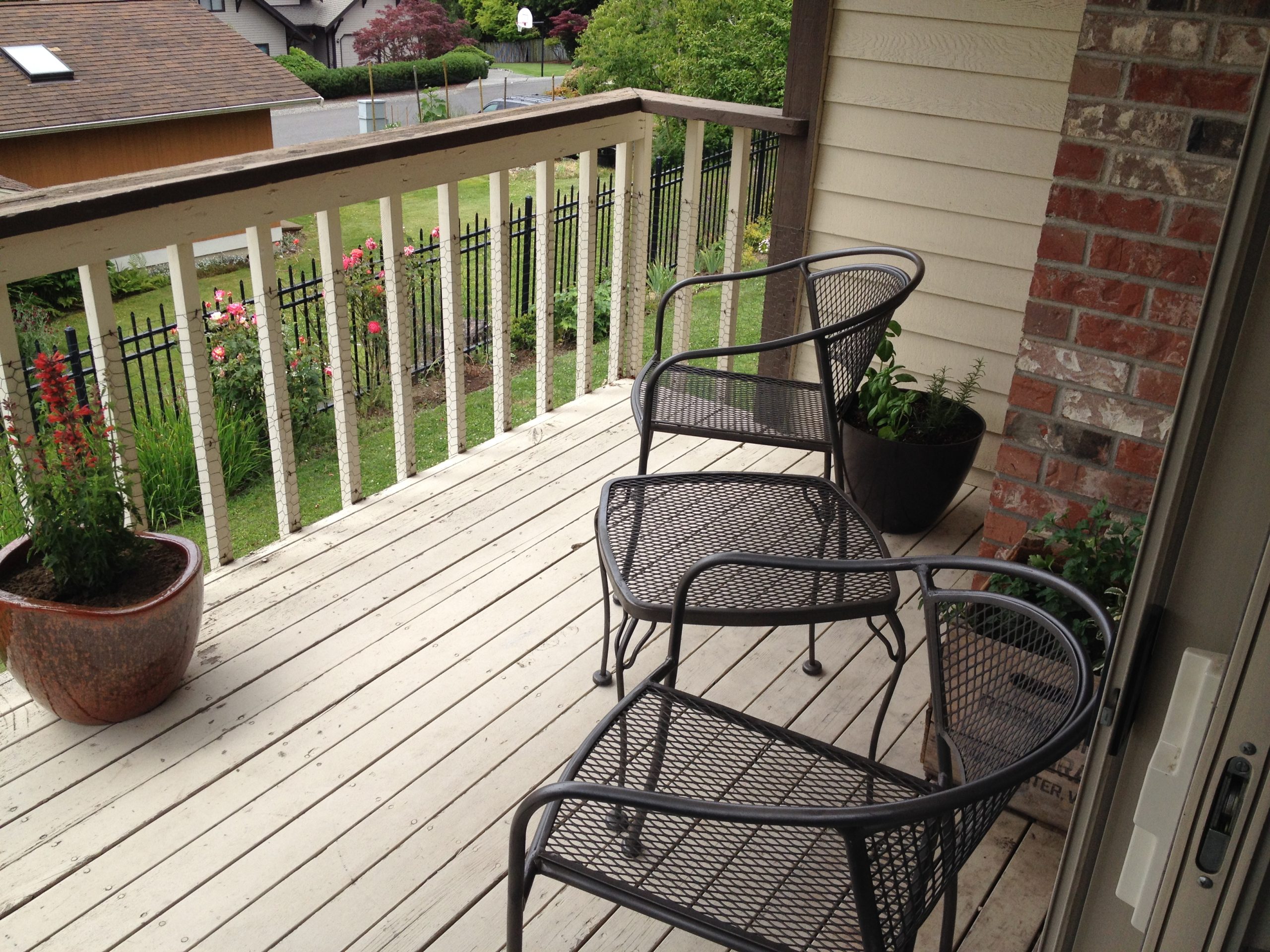
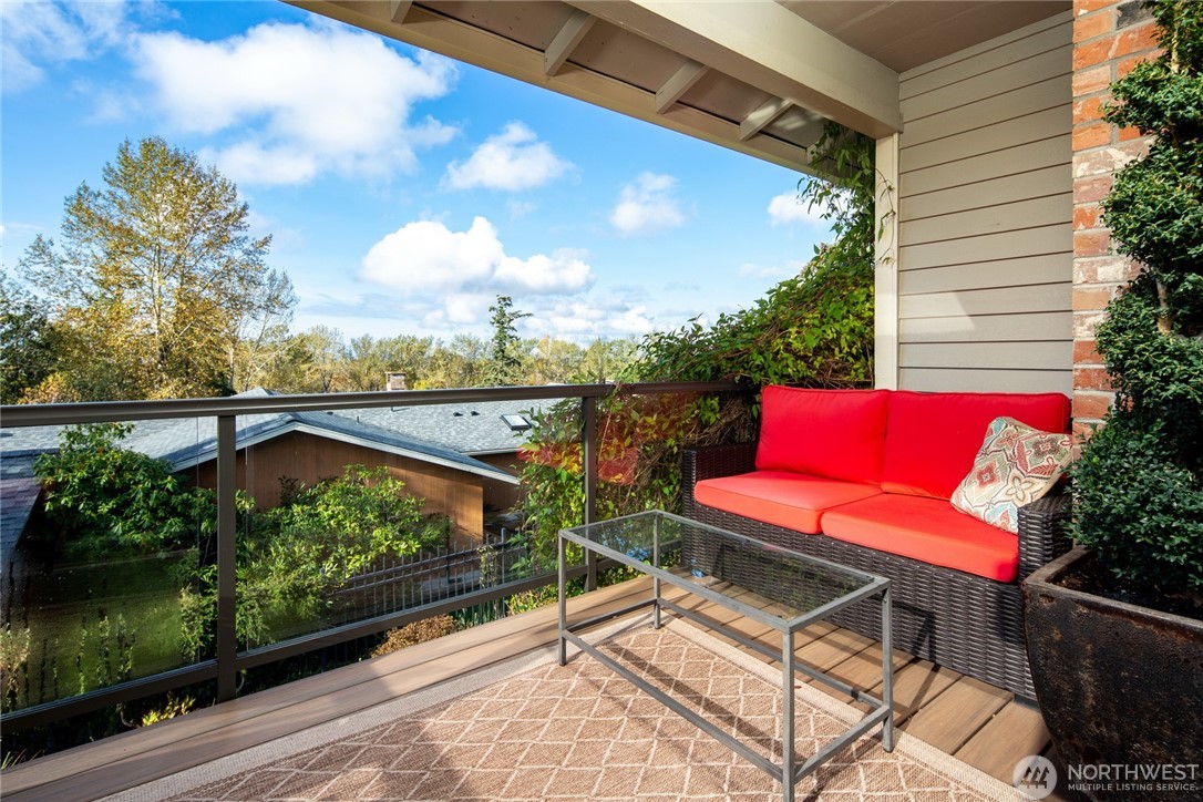
The porch off the dining room was small and in poor shape but offered a nice season view and was covered allowing for use during our rainy seasons. The new composite decking matched the color of the interior floors to create a nice flow and connection. The glass rails visually expanded the space and gave it a clean look in keeping with the overall exterior aesthetic.
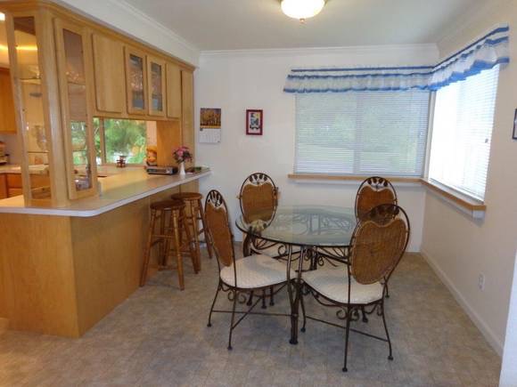
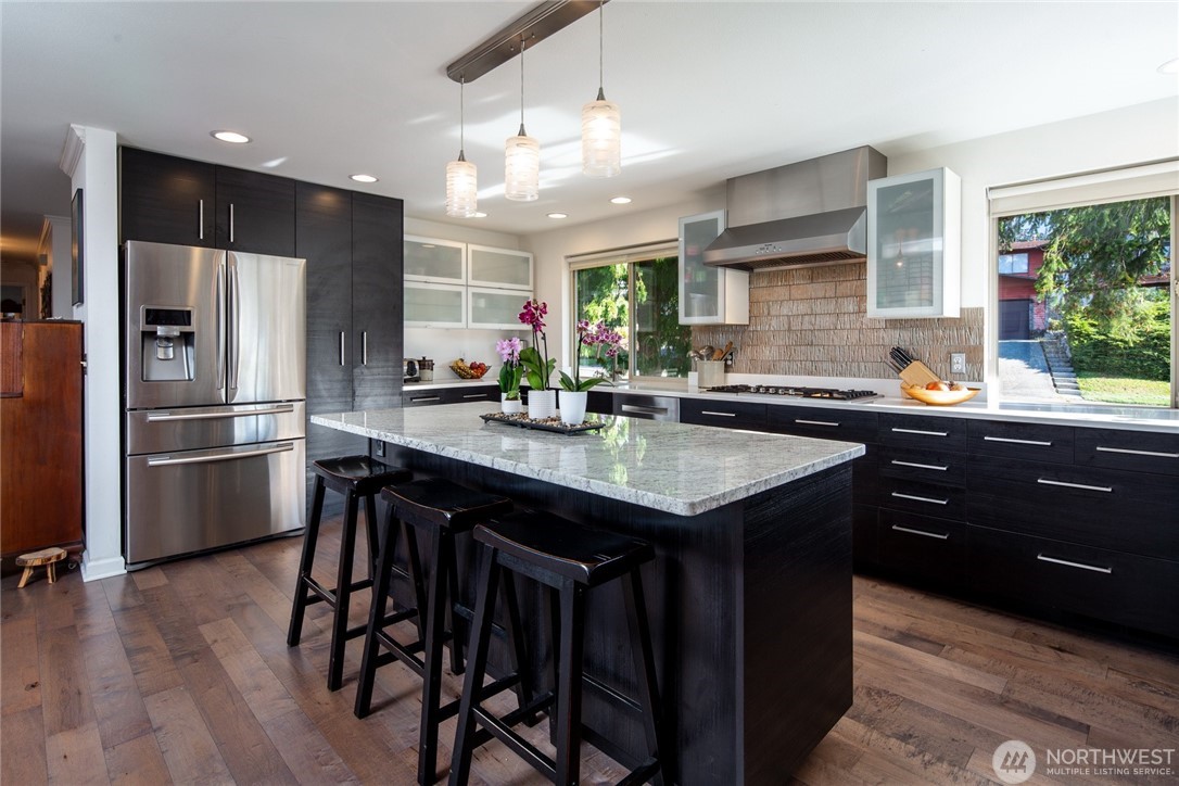
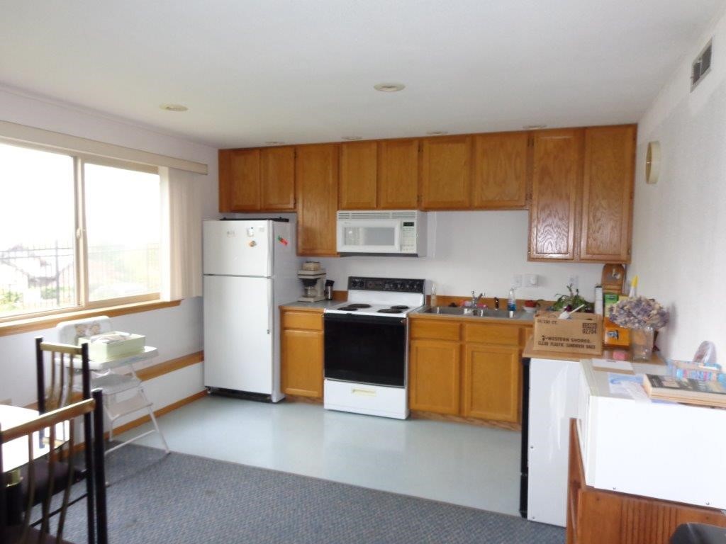
Originally, the kitchen felt tight and disconnected from the rest of the home, divided by a wall and pantry closet. Removing both completely transformed the space, creating an open, inviting flow between the kitchen, living, and dining areas. Running the cabinets the full width of the wall made room for a long island that was perfect for food prep and gathering space. We chose simple IKEA cabinetry as a smart, budget-friendly solution for a home that needed work from top to bottom.
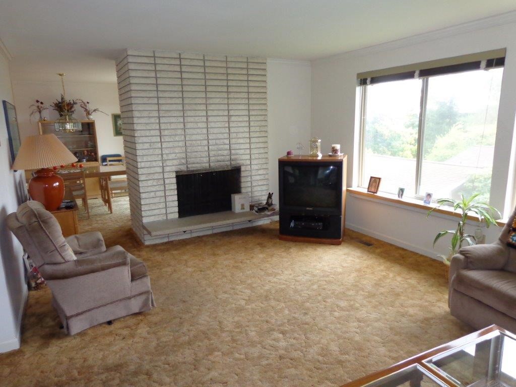
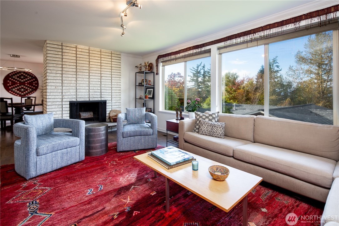
The living room had great bones but felt stuck in the ’80s thanks to worn carpet and laminate windowsills. Engineered wood floors instantly modernized the space, while bright white paint created the perfect neutral canvas for our colorful art and textiles. Since there was no overhead lighting, we added it to improve both function and mood. The wood-burning fireplace remained untouched as its simple, timeless design remained a perfect complement to the updated room.
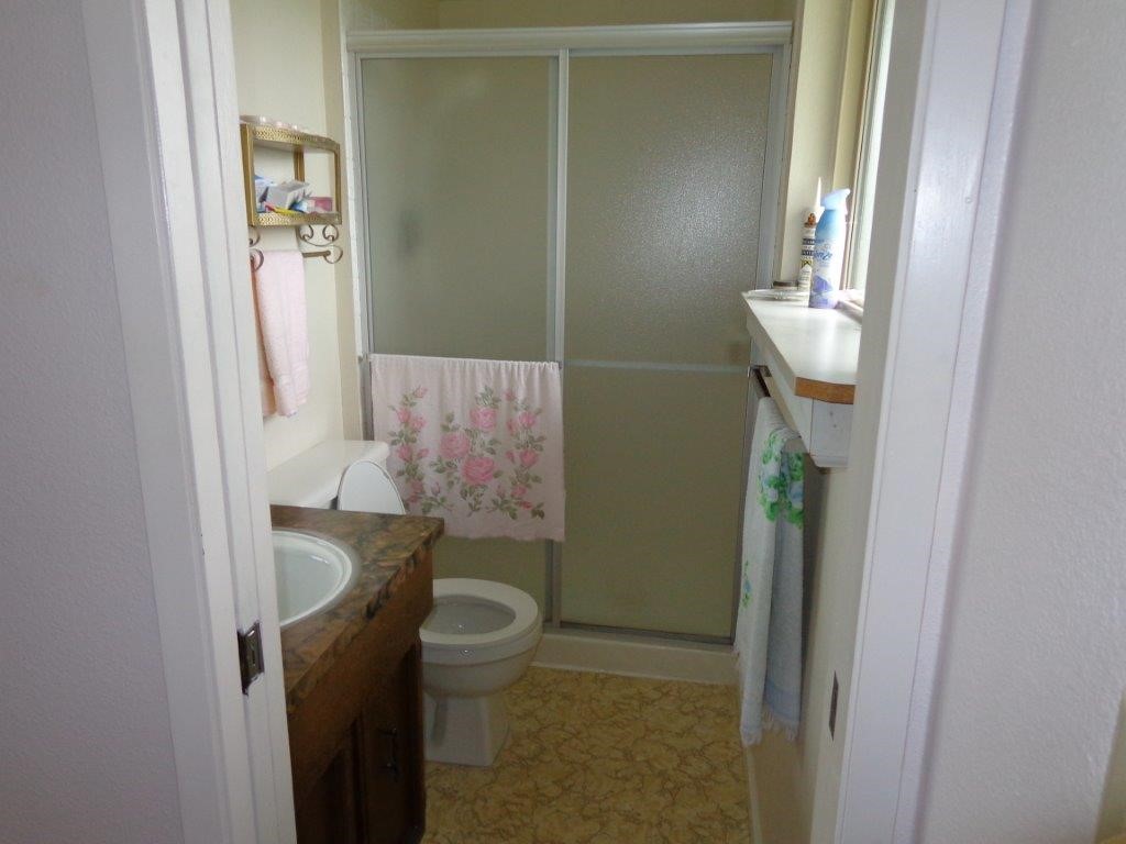
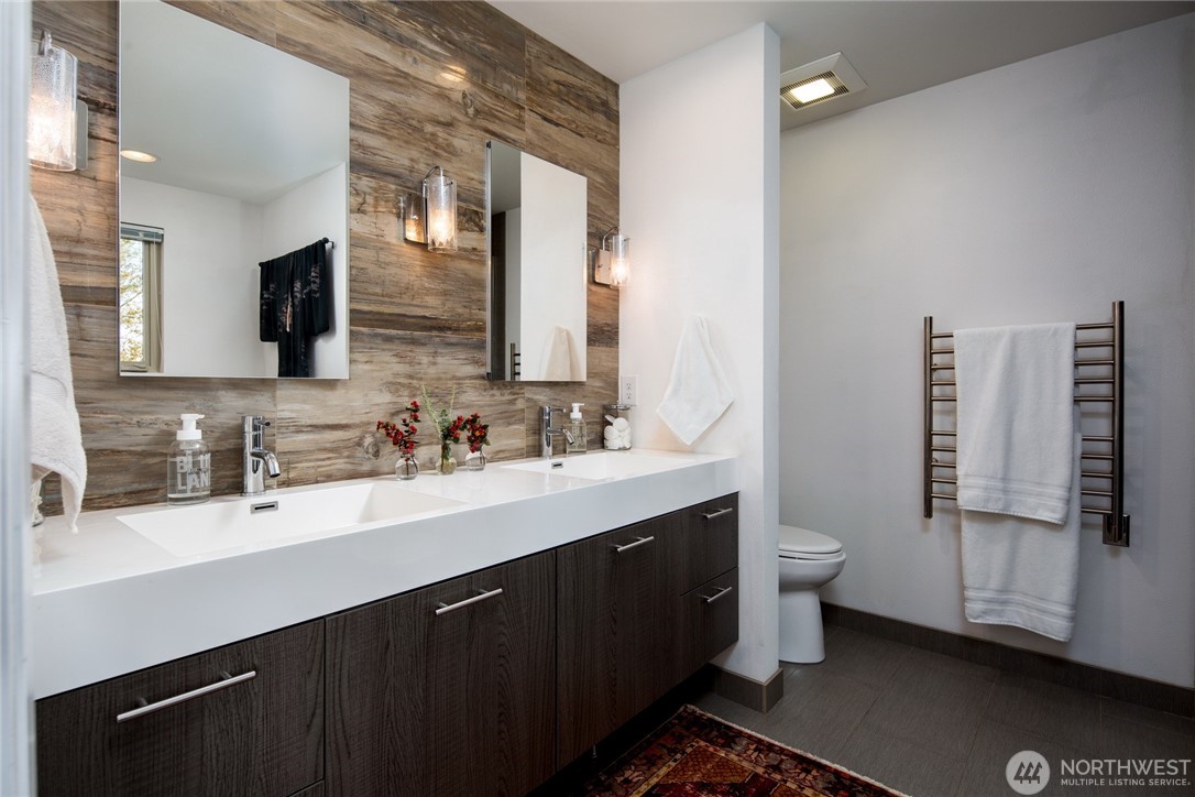
Though the primary bath was originally quite small, it shared a wall with a full-size hallway bathroom which allowed us to reassign the space. By converting the hall bath into a compact powder room and taking over the remaining space, we were able to greatly expand the primary. The new layout allowed for a generous six-foot vanity, a large soaking tub, and a walk-in shower. Ceramic tile that mimics petrified wood added striking texture and anchored the overall spa-like feel of the space.
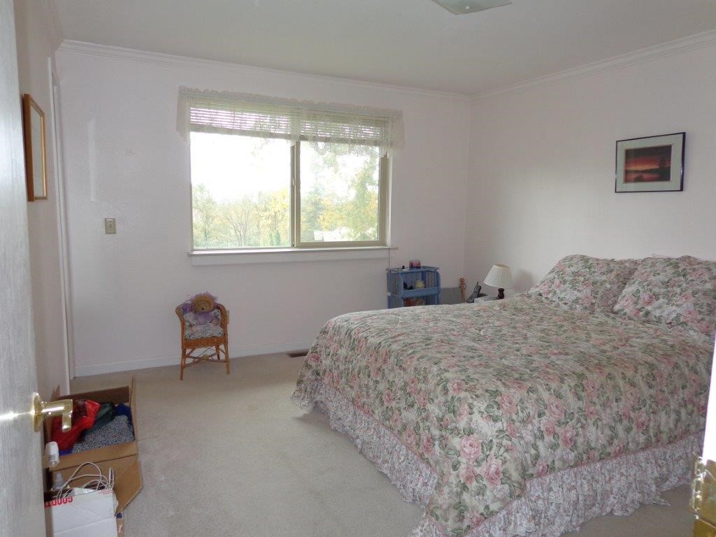
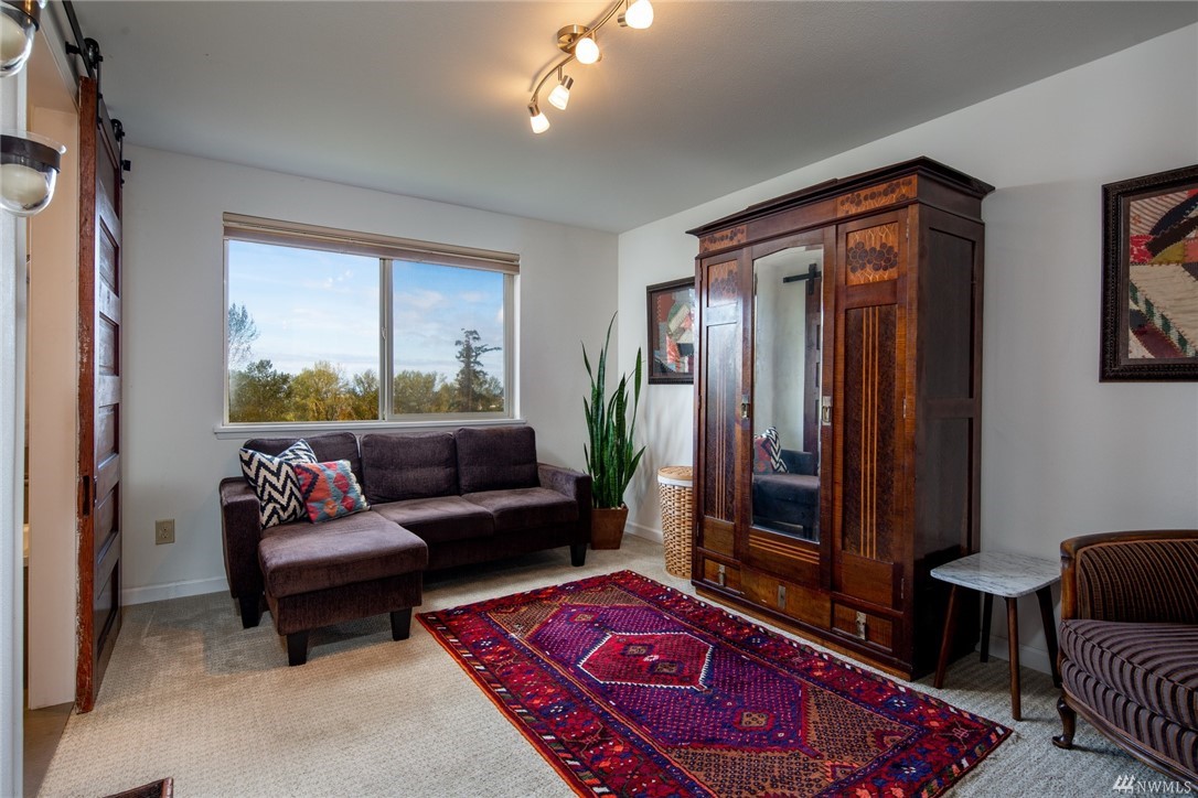
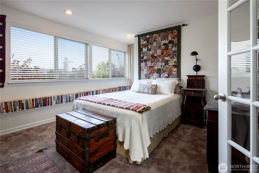
By merging two modest bedrooms at the end of the hall, we were able to create a true primary suite. The center wall was rebuilt to include a generous closet while also defining the sleeping area from a dedicated seating space. A salvaged rolling door from a local restoration shop became the perfect vintage accent leading into the bath.
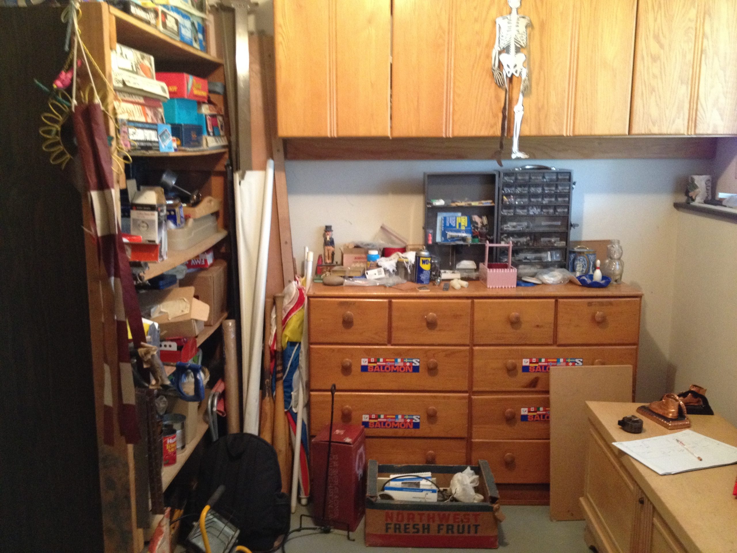
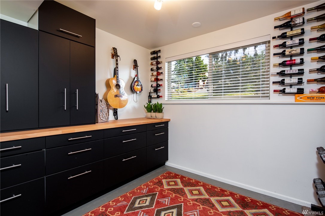
Once an eyesore and catch-all, the utility room was completely reimagined with storage and personality in mind. Custom cabinetry, instrument storage, and wine racks brought both function and character, while thoughtful design helped visually balance the challenging window wall and exposed footer. What was once a room best hidden, it became a space that was warm, multifunctional and inviting.
The downstairs family room was a generous, multi-use space with several areas flowing together. We were able to relocate the laundry out of the downstairs bath and into it's own space by walling off the second kitchen to create a separate room. Glass French doors were then added to create a private guest bedroom that still feels connected yet distinct from the larger family room. A disruptive footer along the window wall became an asset when repurposed as a long bookshelf for our many books.
